
A simple density plot describing the healthcare system’s inability to respond to the devastating human toll of COVID-19 inspired what can be considered the most notable slogan of the coronavirus pandemic: “flatten the curve.” Succinct and powerful, this phrase has helped drive public health responses across the globe and has been referenced repeatedly by both public health officials and the media.
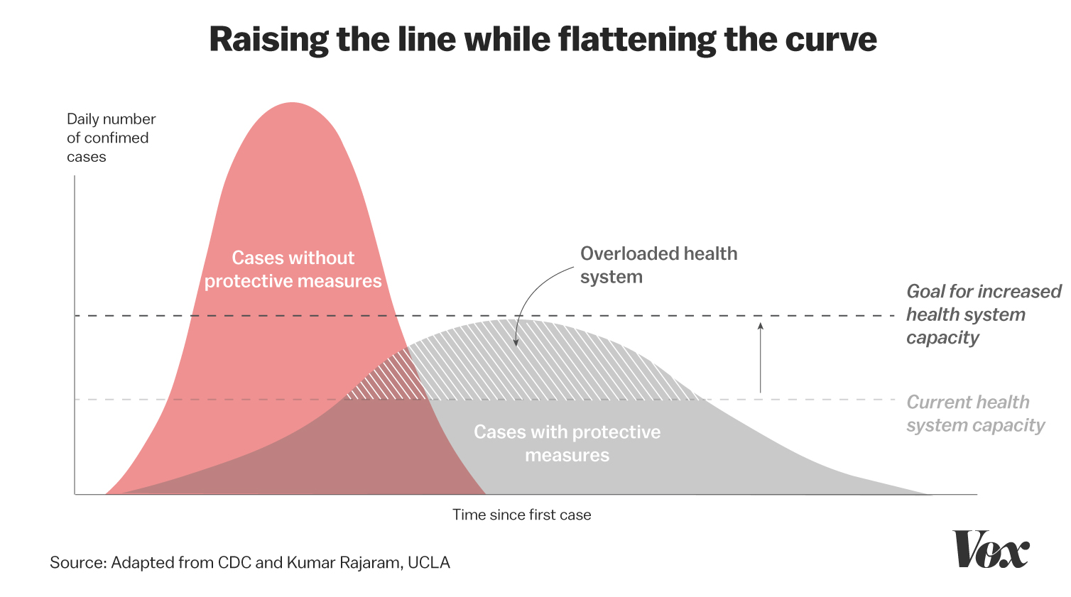
(Photo credit: Vox)
Since then, data visualizations like this one have become one of the most effective communications tools in this global crisis. Scan your local and national news coverage of COVID-19 and you will find nearly every newscast prominently featuring a graph, chart, or map of some sort. Online they are often the visual centrepieces for in-depth coverage; for example, the CBC’s COVID-19 tracker and Global News’ coronavirus tracker.
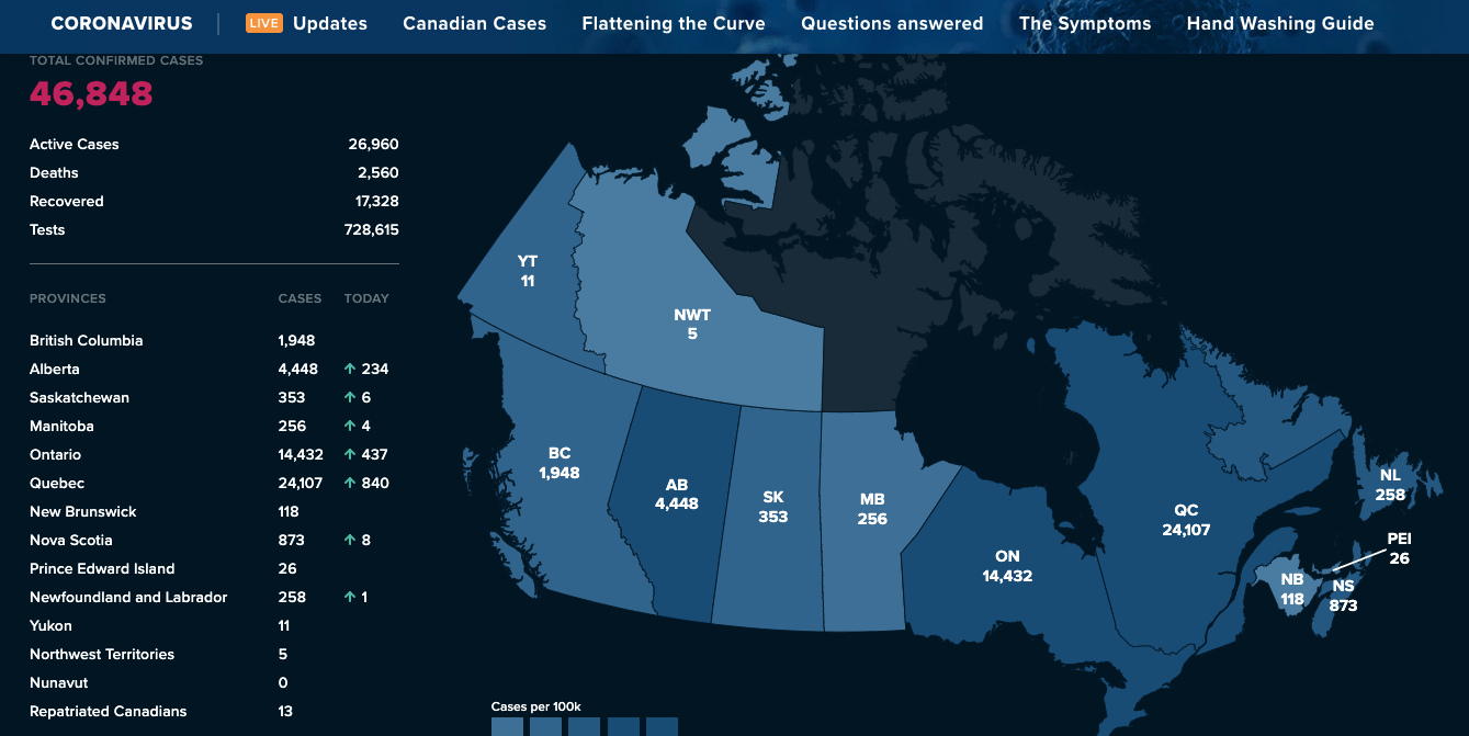
(Photo credit: Global News)
This global pandemic is an inherently numbers-driven story demanding this type of visual treatment to make sense of the statistics. In this context, data visualizations have emerged as the digital standouts during a global health crisis that has challenged the conventions of on-the-ground reporting and newsgathering. They communicate with an effortless clarity (because of pre-attentive properties), and behind each is a data journalist likely cleaning a messy data set, running the numbers through visualization software, spot checking data points, and selecting a colour palette to communicate meaning.
It has been data journalism’s time to shine, and it is encouraging to see the craft take centre stage at such a critical moment in history. In 2016 when I was a journalist in Toronto, I was one of a small handful of reporters who actually practiced data journalism. There were so few of us, it was easy to keep track. Global News (my former employer) had a strong stable of data journalists and their newsroom was a leader in the field—people like Patrick Cain, Leslie Yonge, Anna Mehler Paperny, and David Weisz were highly skilled and won awards for making numbers meaningful.
Back then—at least among broadcast journalists—it was a bit of an esoteric skill few understood. “So what is data journalism?” was a common question I would routinely get asked. Many thought it was simply Photoshop on steroids, to which I would politely smile but internally cringe as I explained how numbers, data, and formulas rendered the visual elements in relation to one another. As any data journalist knows, you can’t just “eyeball” the length of a bar along the x-axis or make a pie chart three dimensional.
People considered it quaint, novel, and “nerdy”—a value-add that was great to have, but not necessary. I’m happy to see this perception of novelty is changing. The skills required to go from thousands of rows of data in a spreadsheet (“dimensions” and “measures” if I may use the language of Tableau) to something more intelligible and visually appealing is proving itself a core competency every newsroom must have and nurture during the coronavirus pandemic. This is good for journalism.
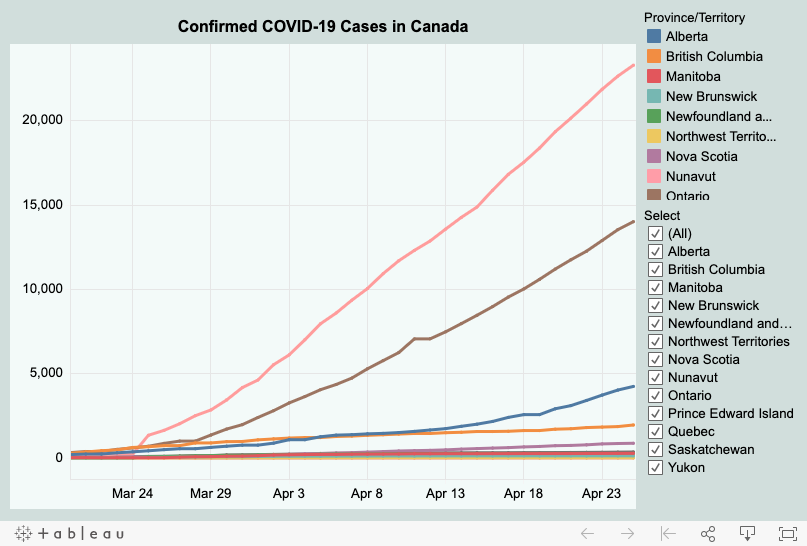
Not only do data visualizations hold people to a page, increase engagement, and communicate information meaningfully, they’re also effective storytelling tools. Take for example the animated visualization below, which in 45 seconds narrates the international response to the virus; namely, how some countries were able to quickly and effectively manage their infection rates while other countries could not. By the end, the United States can be seen as sluggish and clumsy in how it dealt with a silently spreading virus, which has resulted in the country leading in global infections and deaths.
This animated graphic from the BBC shows the worldwide progression of the pandemic through this week. It’s worth watching.
Watch, in particular, for the appearance of the US at the beginning of March, and then the speed at which the US epidemic takes off. pic.twitter.com/jcvUPUSl7u
— Rachel Maddow MSNBC (@maddow) April 8, 2020
I currently teach data visualization at a local college and there is a concept in education known as “micro learning”; e.g., a YouTube video tutorial or short radio interview that teaches you about a specific topic in one easy self-contained segment of instruction. I would consider this “micro storytelling.” It is accessible, low-barrier, and easily consumable. Evidence of this can be seen in the 1.2 million views and 15,000 retweets it has earned.
Data visualizations have also fueled strong public-service journalism that probes deeper into important issues. This series of choropleth maps featured in Rolling Stone point to the social inequities plaguing the United States, where Black communities are disproportionately bearing the brunt of this novel killer.
The upending of our daily routines and comfort by the coronavirus has introduced society to a many new things: the concepts of physical distancing and contact tracing, Zoom, and also the effectiveness of data journalism and visualization. I am hopeful the spotlight shining on the latter will inspire a new type of journalist to enter the field—one who is equally comfortable with numbers and coding as they are with words.
For me, even after leaving the industry, data journalism continues to be an indispensable skill. Visualizing data has played a key role in a COVID-19-related project I’ve been working on during these weeks in self-isolation. Becoming comfortable around data—and the importance of it—has made me more self-aware of when I act on biases and heuristics rather than evidence and reason. And in today’s world, where anyone can author a dubious hot take through a Medium post, it is an area of knowledge that is critically important.
During this time of crisis, it has become abundantly clear that journalism is needed now more than ever. It is that essential service underpinning the efforts of doctors and politicians trying to lead their communities out of crisis. Without the frontline reporting, vigorous fact-checking, and storytelling of reporters—especially now—society would be mired in an uncertainty and ignorance that would have serious consequences for people’s health and safety. Despite its importance to our collective welfare, journalism has been struggling with revenue and profitability for years and has had to evolve. While not all the changes have been positive for the industry, this one—data journalism—is a hopeful sign for the future.
Subscribe Now – Free!
Broadcast Dialogue has been required reading in the Canadian broadcast media for 25 years. When you subscribe, you join a community of connected professionals from media and broadcast related sectors from across the country.
The Weekly Briefing from Broadcast Dialogue is delivered exclusively to subscribers by email every Thursday. It’s your link to critical industry news, timely people moves, and excellent career advancement opportunities.
Let’s get started right now.


